In a changing landscape of digital marketing, finding unique ways for a brand to stand out and connect emotionally with its audience or generate more conversions may come in different shapes and styles. One of the most influential techniques, yet often underrated, is marketing colour psychology. Colours have an impact on the way people perceive, feel, and behave. They can drive decisions, influence emotions, and create tremendous brand experiences. When leveraged strategically, marketing colour psychology turns into a device capable of fully redefining your marketing performance.
This guide explores everything you need to know about marketing colour psychology, such as how different colours influence consumer behaviour and how businesses can use colour strategically across branding, advertising, website design, packaging, and social media.
What is Marketing Colour Psychology?
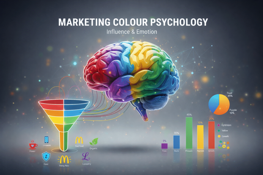
Marketing color psychology is about how hues shape feelings, thoughts, and buying choices. Each shade sends a quiet signal without people noticing. Companies tap into this because it guides what buyers do – so they pick tones that match their goals. Instead of guessing, they choose shades that quietly push the right buttons.
- Influence emotions
- Improve brand recognition
- Increase conversions
- Control customer attention
- Communicate brand personality
- Improve ad performance
Studies show nearly 9 out of 10 quick buying choices hinge on colour – no other factor comes close. Because of this, how people react to shades shapes everything from logos to web pages; it guides ads, button styles, even how products are wrapped. Instead of logic, feelings sparked by tones drive what we grab off shelves or click online.
Why Colours Matter in Marketing
Here’s why marketing colour psychology is essential for any brand:
1. Immediate Emotional Response
Red grabs you fast, while blue feels steady. A shade might spark feelings before you even think. That instant reaction? Marketers use it to guide choices. These gut responses shape how we click or buy.
2. Stronger Brand Identity
Using steady hues helps companies boost visibility up to 80%. This explains why big names lean heavily on colour insights when shaping how they appear.
3. Influences Customer Perception
Colours give shoppers a sense of safety, spark excitement, suggest luxury, feel young, bring peace, or boost energy. Using marketing colour psychology shapes how people see a brand – matching the image it wants to show.
4. Higher Conversion Rates
Just tiny tweaks – like swapping the hue on your CTA button – might seriously lift how many people click through
The Meaning of Colours in Marketing
Colours matter more in ads than you’d think. Because they stir feelings, guide choices, one moment they’re helping folks bond with a company right away. That’s when the mind-game of colour kicks in – showing what vibes each hue brings, also how businesses can ride that wave smartly.
Check out what colors stand for in ads, while companies pick them on purpose.
1. Red – Energy, Urgency, Passion
Red stands out big time when it comes to colours used in ads. Because it stirs up energy, brands use it during deals or promotions. Fast food logos? Yep, they love this shade too – it pushes people to act quick.
Best for:
- Clearance events along with special deals
- Snacks or drinks companies
- Entertainment brands
Examples: Coca-Cola, YouTube, Netflix
Red boosts hunger, pumps up energy, or grabs attention fast. That’s why it shows up everywhere in ads – especially during sales.
2. Blue – Trust, Stability, Security
Blue conveys reliability and calmness. In marketing colour psychology, it is considered the “trust colour.”
Best for:
- Finance and banking
- Healthcare
- Technology companies
- Corporate brands
Examples: Facebook, PayPal, Samsung, LinkedIn
Blue helps people feel calm while giving off safety vibes – so it’s no surprise many trust-focused fields use it. Despite trends, this shade still leads the pack across global branding strategies.
3. Yellow – Optimism, Happiness, Warmth
Yellow grabs attention, feels lively because it’s so warm. Great for companies aiming to seem fresh since it pops without trying too hard.
Best for:
- Kids’ products
- Youth-focused brands
- Brands promoting joy and happiness
Examples: McDonald’s, Snapchat
Bright yellow pops fast, so brands often use it to catch eyes while giving off friendly vibes instead.
4. Green – Growth, Nature, Balance
Green feels fresh, also brings a sense of peace. It connects closely with well-being, the outdoors, quiet moments, or eco-friendly choices.
Best for:
- Fresh yet natural labels
- Fitness and wellness
- Finance (wealth symbolism)
- Travel and nature
Examples: Starbucks, Whole Foods, Spotify
Green’s calming effect makes it a crucial colour in marketing colour psychology for well being-related brands.
5. Black – Luxury, Power, Elegance
Black feels strong, yet classy – lasting through time without fading into background noise. It shows power while hinting at luxury, standing out quietly.
Best for:
- Luxury brands
- Fashion
- High-end tech products
Examples: Chanel, Apple
In marketing, black makes a brand feel fancy – so it stands out. It’s not just about looks though; this shade gives off serious prestige vibes.
6. Orange – Confidence, Enthusiasm, Friendliness
Orange feels lively, yet super approachable. Because it pushes you to move, there’s always a spark in the air. While some colors chill out, this one jumps right in.
Best for:
- Ecommerce offers
- Call-to-action buttons
- Youth-focused campaigns
Examples: Amazon, Fanta
Orange fires up energy while sharpening choices on the spot. That’s why marketers often pick it for buttons that push action.
7. Purple – Royalty, Creativity, Imagination
Purple ties to richness, creativity, or inner peace.
Best for:
- Beauty yet skincare names
- Premium service brands
- Health-focused shops that thrive on fresh ideas
Examples: Cadbury, Hallmark
In marketing colour psychology, purple stands for uniqueness – also sparks imagination.
How to Choose the Right Colour for Your Brand
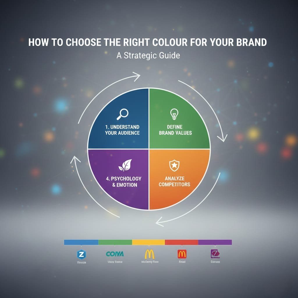
To use color in marketing well, figure out your brand’s vibe plus how customers react emotionally.
1. Understand Your Audience
Different groups respond differently to colours. Knowing your audience helps apply marketing colour psychology correctly.
For example:
- Girls usually go for lighter shades that feel peaceful
- Guys usually go for darker, punchy colors
Finding out what people like makes it easier to use colours in marketing the right way.
2. Define Your Brand Personality
Ask yourself:
- Do you sell high-end products?
- A playful, fresh vibe?
- An eco-friendly brand?
Your color choices need to fit the vibe you’re going for – go with tones that feel like you.
3. Study Your Competitors
Check out the shades others in your field are picking.
This isn’t about copying – grasping trends lets you work marketing colour psychology into your marketing so you pop out yet stay aligned with your field.
4. Test Colour Variations
Testing different versions of buttons, yet seeing how banners perform can show what clicks. Trying out package designs at the same time gives clues on what sticks.
Sometimes just switching up the hue of a CTA button boosts conversions big time. That’s how come experimenting matters when mixing colours into your marketing moves.
Colour Psychology in Digital Advertising
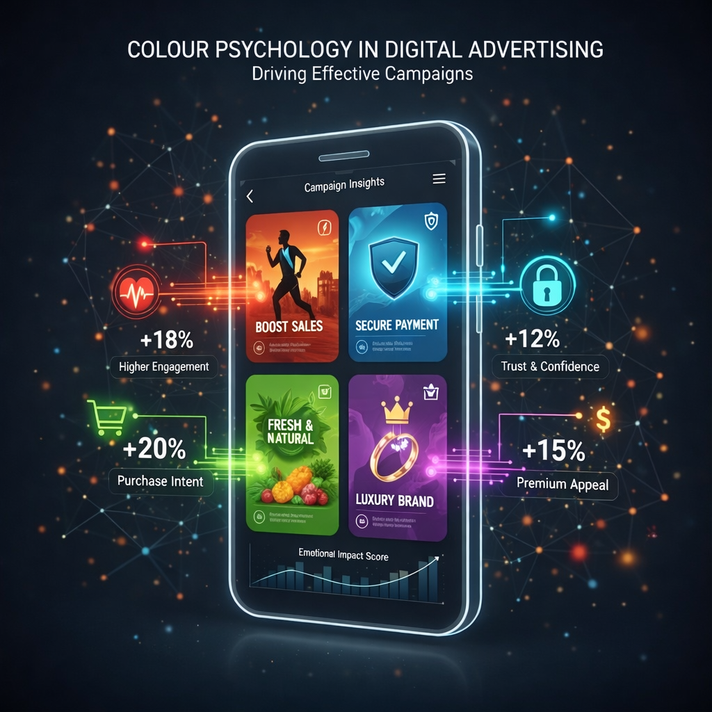
Marketing colour psychology directly influences:
- Clicking behaviour
- Attention span
- Emotional response
This is the way marketing colour psychology affects ads on various platforms
1. Facebook & Instagram Ads
- Red → Creates urgency
- Blue → Builds trust
- Yellow → Grabs attention
Companies tweak background shades, edges, or font tones – sometimes all three – to catch more attention on ads.
2. Google Ads
Picking a CTA shade that fits the text boosts taps – so go with tones that blend well.
Examples:
- Green CTA = calm, reassuring action
- Orange CTA = energetic, immediate action
This reveals just how tightly colour choices in ads link to results-driven strategies.
3. Website CTA Buttons
A tiny tweak – say, making a button red instead of blue – might boost sign-ups by nearly a third. One little color shift could lead to way more clicks. Changing just one thing may result in much better results. Try swapping hues and see what happens. Even minor moves can make a real difference.
This is exactly why UX folks lean on color tricks from ads while building sites – using what grabs attention fast.
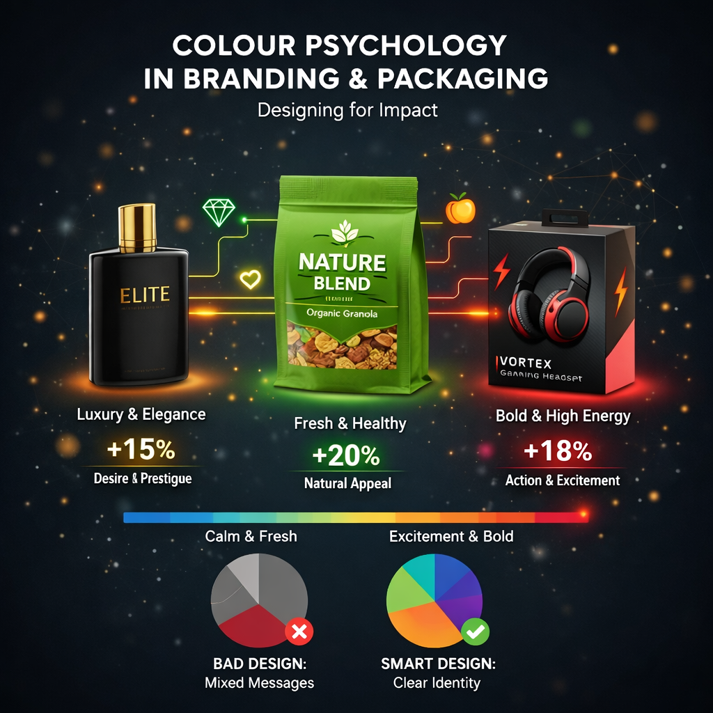
Colour Psychology in Branding & Packaging
The shade you pick for your item or wrap affects how folks see your name.
Packaging colours shape:
- Quality perception
- Trust levels
- First impressions
- Emotional response
Examples:
- Green signals eco-friendly labels
- Black or gold – both scream high-end when it comes to fancy scents
- Go blue – or maybe silver – when picking colors for your tech gear
- Yellow, pink or orange suit young brands
Using smart marketing colour psychology choices based on how people react, companies can create packs that grab attention fast – hitting the mark from the start.
Colour Psychology in Website & UI Design
A good-looking site picks hues that lead users along – using tones to point the way instead of confusion.
Using marketing colour psychology, you can:
- Highlight important sections
- Improve readability
- Boost how long folks stick around on your pages
- Boost clicks
- Guide user flow
Best practices:
- Stick with blue when you want folks to feel safe on the page
- Go with red or orange tones when picking button colors that need attention
- Go with green when things go right
- Go easy on yellow so your eyes don’t get tired
Design teams regularly rely on marketing colour psychology to improve user experience.
How Different Cultures Interpret Colours
Colors carry different meanings in different places. Because cultural backgrounds differ, so does how marketing uses color (marketing colour psychology)
Examples:
- Red → luck in China, danger in Western countries
- White means cleanliness in Western areas, yet sorrow in parts of Asia
- Purple → royalty in Europe, mourning in Brazil
Big companies around the world must pick colors wisely – otherwise, people might get the wrong idea.
Common Mistakes in Colour Psychology
Here’s what companies often mess up when using colours in marketing:
- Using way too many shades
- Faint differences between colors make it hard to see clearly
- Cheating off others’ work without a plan
- Colors not fitting the brand’s look
- Skipping checks on various shades
Trying things out matters if you want your color choices in ads to work well.
Future Trends in Colour Psychology
The way we see colours is changing. Check out what’s new in how brands use colour to connect with people
1. Nature-inspired shades
Leafy tones, earth hues – these shades took off after lockdowns ended.
2. Flickering lights mixed with bold, space-age tones
Younger folks lean toward bright, vivid lights.
3. Pastel minimalism
Fits well with health-focused companies or those into daily self-care routines.
4. AI-driven colour personalisation
Soon, machines might pick colours by watching what people do.
Conclusion
Marketing colour psychology shapes feelings, guides choices. When making packaging, crafting a brand look, posting online ads, or setting up a site – picking the right shades builds links with people, lifts response rates.
Knowing how colors affect mood helps companies build deeper bonds while making ads that grab attention. Since images matter way more now, getting color psychology right isn’t just useful – it’s a must.